Copper
Brand development for a digital-asset custodian, built on the observation that the category confuses people, and that saying so out loud is the opening.
Objective
Copper sits at the institutional end of digital assets, custody and infrastructure for firms whose obligation is not to lose things. That is a conservative promise made in a category most people find bewildering.
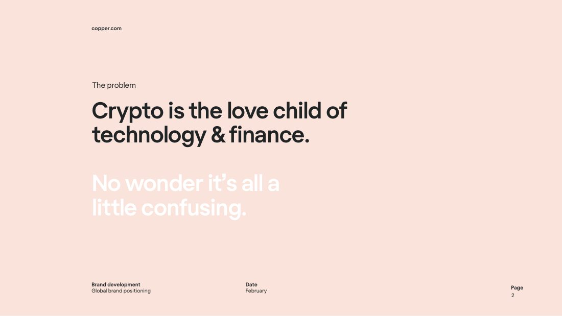
The document names it rather than dressing it up: “Crypto is the love child of technology & finance. No wonder it's all a little confusing.” Setting the problem as confusion rather than complexity is what lets the brand answer it with clarity instead of authority.
Creative response
Master brand development and a paid-social growth campaign.
- Master brand development. A document taking the brand from the problem statement through to a positioning
- Two concept routes, worked as separate InDesign documents
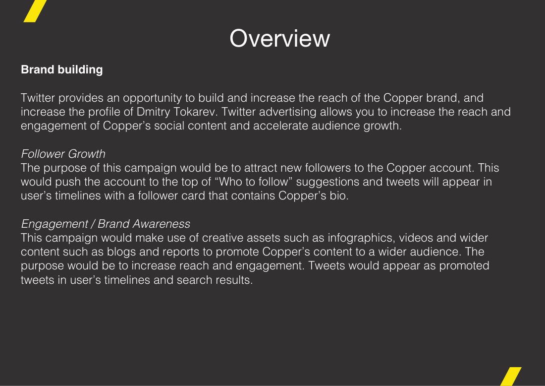
- A LinkedIn and Twitter follower-growth plan, 14 October 2020
- Eighteen finished social advertisements, twelve Twitter in-stream posts at 1200×675 and six LinkedIn shared images at 1200×627, each built from a live InDesign template rather than resized from one master
- Social cards for editorial posts, including an OECD blog and a Russia piece
- Animation assets. Vector artwork cut for motion: a US map, arrow, phone and graphic set supplied as layered.ai and.eps
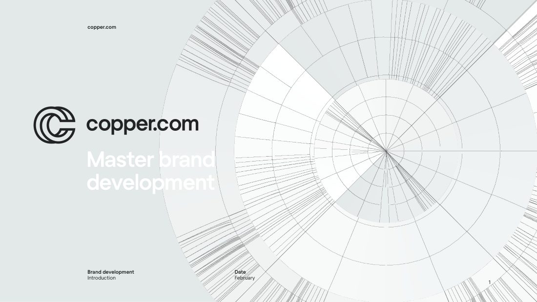
The brand document opens on a radial diagram, hundreds of fine lines converging, before it opens on a word. For a custodian, the argument is that everything comes through one point and that point holds.
Then the very next page says the category is confusing. Placing an admission immediately after a statement of scale is a deliberate order: it earns the clarity that follows, which is what an institutional buyer is actually shopping for.
The advertising is built the same way. Two live InDesign templates, one at Twitter's in-stream ratio, one at LinkedIn's, rather than one master cropped twice, so a headline that needs three lines on one platform gets three lines rather than a smaller typeface.
- Master brand development. A document taking the brand from the problem statement through to a positioning
- Two concept routes, worked as separate InDesign documents
- A LinkedIn and Twitter follower-growth plan, 14 October 2020
- Eighteen finished social advertisements, twelve Twitter in-stream posts at 1200×675 and six LinkedIn shared images at 1200×627, each built from a live InDesign template rather than resized from one master
- Social cards for editorial posts, including an OECD blog and a Russia piece
- Animation assets. Vector artwork cut for motion: a US map, arrow, phone and graphic set supplied as layered.ai and.eps
The work