Halifax
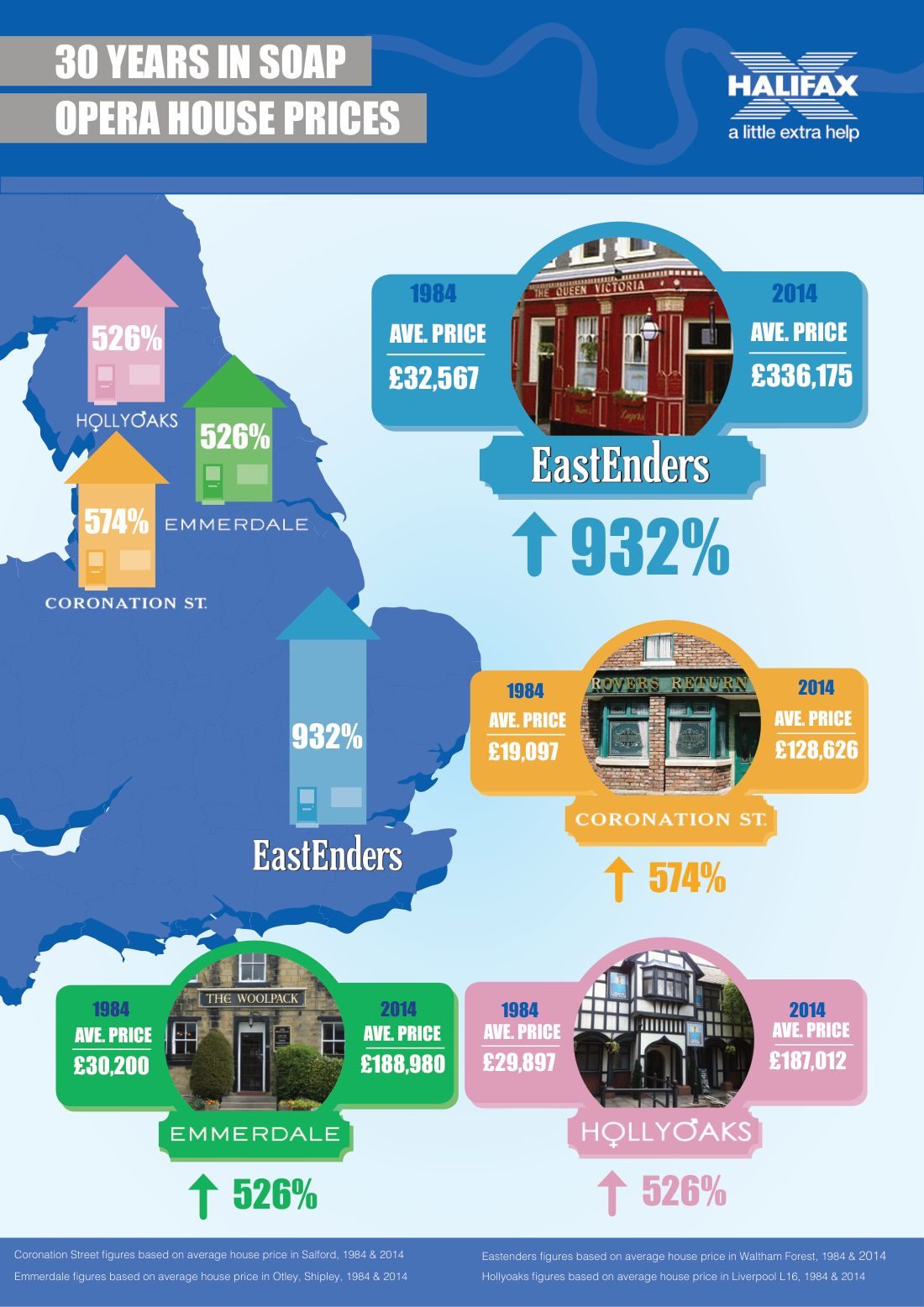
A single-page data infographic, 30 Years in Soap Opera House Prices, comparing 1984 and 2014 average house prices in soap-opera locations, with growth running as high as 932%.
Creative response
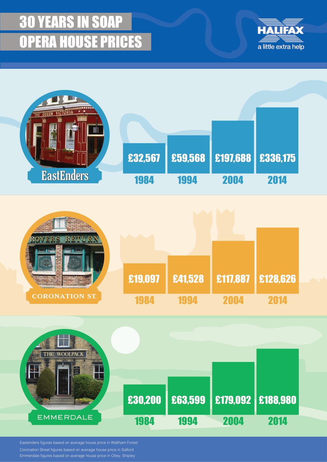
One page, dated February 2015, titled “30 Years in Soap Opera House Prices”. It sets 1984 against 2014 average house prices in the locations of British soap operas, and shows the growth between them.
The growth figures recorded on the page include 526%, 574% and 932%. Two of the underlying pairs are on the artwork: £32,567 rising to £336,175, and £19,097 rising to £128,626.
Data infographic design for Halifax. The dataset is the lender's; the framing device, soap-opera locations as the lens on thirty years of house prices, is what turns a price series into something a general audience will actually look at.
Why this format exists
A lender's house-price data is genuinely interesting and almost impossible to make anyone read. Attaching it to soap operas solves that in one move: every location already has an audience, a recognisable image and thirty years of associations attached to it, so the comparison lands before the numbers are read.
It is also self-evidently built to be picked up. A single page, a strong hook, three headline percentages and clean before-and-after pairs is the shape of a piece designed for press and social distribution rather than for a report annexe.
The artefact above is the actual commissioned work.
Why this format exists
Results
1984 → 2014, the thirty-year comparison the piece runs on
£19,097 → £128,626, one of the legible before-and-after pairs
FEB 2015, date on the artefact
The work