Shelle
A performer who works in three disciplines, and a brand that had to hold all three without splitting into three.
Objective
A working performer presents, sings and records voiceover. To a booker those are three different products with three different buying decisions, and the instinct is to build three shopfronts.
The problem with that is the thing being sold. A performer is booked because of who they are, not which category they filed themselves under, and a brand split three ways stops answering the only question that matters.
Creative response
Brand identity and website design, direct to the client.
- Naming. The rounds run under two names, the full name and the short one. Shelle is what the finished brand and the website were built on
- Wordmark exploration. Serif and script treatments across two colourways, then a second sheet working a single direction through four variants
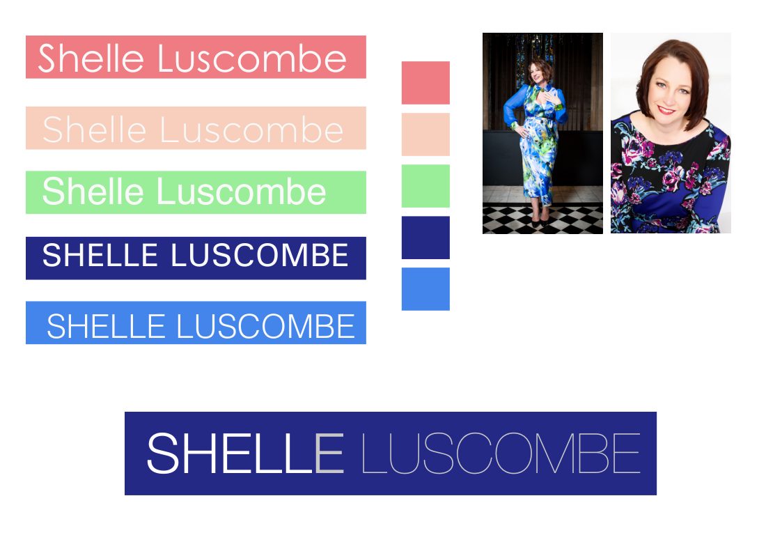
- Logotype round. Five treatments, condensed sans, script, mixed weight, all-caps reverse, each set against its own colour palette rather than shown in isolation
- The chosen mark. A script Shelle against a lighter grey Luscombe, so the short name leads and the full name is still there to be read
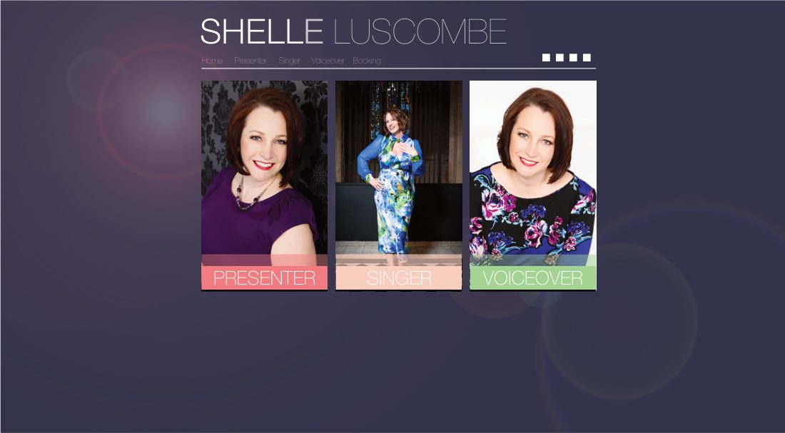
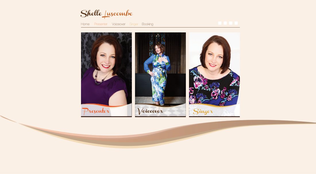
- Three website concepts. One resolves the three-disciplines problem directly, carrying Presenter, Singer and Voiceover as three routes off a single identity rather than three sites
The colour palette sits beside each logotype in the presentation rather than on a separate sheet. That is a small decision that does most of the work: a mark and a palette are one choice, and showing them apart invites a client to mix a wordmark they like with a colour they like and end up with neither.
The three-discipline split was solved in navigation rather than in the identity. One mark, one voice, three doors.
- Naming. The rounds run under two names, the full name and the short one. Shelle is what the finished brand and the website were built on
- Wordmark exploration. Serif and script treatments across two colourways, then a second sheet working a single direction through four variants
- Logotype round. Five treatments, condensed sans, script, mixed weight, all-caps reverse, each set against its own colour palette rather than shown in isolation
- The chosen mark. A script Shelle against a lighter grey Luscombe, so the short name leads and the full name is still there to be read
- Three website concepts. One resolves the three-disciplines problem directly, carrying Presenter, Singer and Voiceover as three routes off a single identity rather than three sites
The work