WL Distillery
A County Durham spirits producer given a scalable label system, then venue editions, anniversary bottles and a heritage range built on top of it.
Objective
WL Distillery's bottle labels relied heavily on generic County Durham imagery and did not form a scalable family. Each new flavour meant a new argument about artwork rather than a slot in an existing system, and nothing on the shelf told a customer how one bottle related to the next.
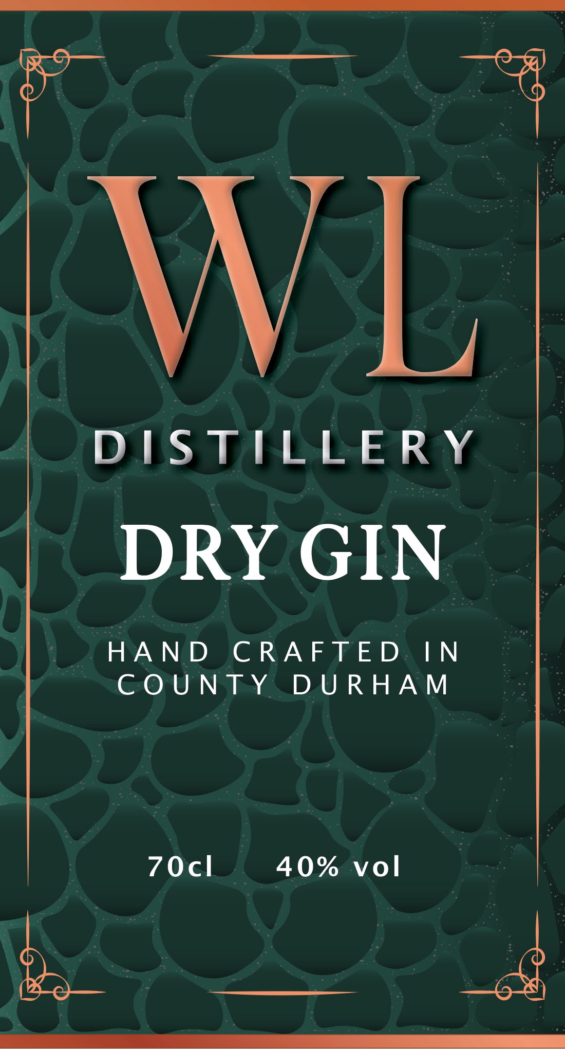
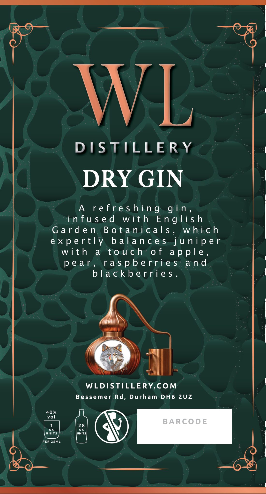
The proposed replacement used colour as the primary flavour-navigation system, supported by a consistent label architecture and restrained regional texture. Green represented juniper and the North East; copper referenced prestige and the distillery's copper stills. Hadrian's Wall, castles and Kielder topography were considered as subtle background sources rather than literal scenery.
Mike Berriman approved the bottle-striking, background-colour strategy but asked to remove “2025” and reconsider the “North East” wording. The complete still, wolf, stars and WL Distillery logo composition later became a locked asset that could not be edited, a constraint the rest of the system had to design around.
Creative response
Brand strategy, packaging, presentation, print preparation, product storytelling, sales collateral and campaign imagery. Work was coordinated through Mike Berriman early on and later through Scott, with Thornton Print handling proofs, cutter guides, outlined-font and EPS requirements and press passes. End clients included The Light in Durham and Lumley Castle Hotel.
The proposal promised clean, premium, scalable colour coding, consistent architecture for expansion, optional regional texture and print-ready PDF and AI artwork.
A September 2025 compliance review turned label law into a reusable checklist: sales denomination “Gin”, 40% vol, declared quantities of 200ml and 700ml, one UK unit per 25ml with eight and 28 units per container, producer name and address, pregnancy warning, Chief Medical Officer 14-unit guidance, Drinkaware reference, barcode, and legibility and field-of-vision rules. Lot and batch coding could be applied by sticker or inkjet; Drinkaware trademark licensing was flagged as a separate consideration.
- Core range. Dry Gin label system and full-range visual work, with retained 70cl, 50cl and 5cl display treatments; Garden Gin front and back labels at 700ml and 200ml, print-ready in September 2025; Watermelon & Liquorice Gin at 700ml and 200ml, final print-ready versions sent.
- Corporate collateral. A tri-fold gifting leaflet repositioned away from generic white label toward corporate gifting, in two versions; a magazine banner; Radio 1 Big Weekend point-of-sale and table-talker material; WL-branded and unbranded conference and custom-gin documents later adapted to the Custom Gin Gifts proposition.
- Lumley Castle anniversary gin.The label was rebuilt after cutter-guide issues, with increased colour contrast, trimmed back-label copy and “Hotel” added to the logo. Recommended finish was matt stock with gold foil on the crest, corner ornaments, castle silhouette and stars. Mike approved the blue and gold direction and requested a Bottle No. box, Batch No. 1 and tighter spacing between “Co” and “Durham”.
- The Light Gin. A premium venue-branded product for The Light, Durham, at 70cl and 20cl, 40% ABV: a citrus-led gin with juniper, elderflower, grapefruit and peppercorn. The preferred concept kept a halftone light beam and a tapered label; the building-led route was deprioritised, “Durham” became “Gin”, “First” was removed and the neck label was ultimately dropped.
- Durham Light Infantry range. A sloe-gin story idea expanded into a premium heritage range. Naming routes included “DLI // Signals”, “DLI // Light Division”, “DLI // Expedition” and “Durham Light Spirits Co.”; range imagery explored London Dry, Lime, Grapefruit, Mango and Vodka across a shared map, constellation and journey system in dark navy, gold, cream and copper. The governing note: “The Colditz story sells a bottle. A modern visual system sells a range.”
Results
Core WL and flavoured-label work, corporate collateral, Lumley Castle and Graduation Gin all reached production or proof stage. A June 2026 review separated the Lumley Castle commission, the original proposal and the later Radio 1, leaflet and banner jobs into distinct pieces of work.
Early retained proofs of The Light Gin still contain placeholder Latin text and must not be mistaken for the final production file, a documented final approval is outstanding.
The work