Diamond Construction
Identity concepts for a Coventry construction firm, worked from a written brief through to a presented set of routes.
Objective
A regional construction company is judged on whether it looks like it will still be trading when the guarantee is called on. That is a narrow brief: the mark has to read as established without pretending to a scale the firm does not have, and it has to survive being applied to a hoarding, a van and a letterhead by people who are not designers.
Creative response
- A written brief, taken and documented before any drawing, the folder holds it as its own dated document
- Two rounds of logo concepts, worked as separate InDesign documents
- A presented concept deck, set out as Diamond Construction (Coventry) Ltd, Logo Design and delivered under his own mark
The brief exists as a document in its own right, dated and separate from the artwork. On a small identity job that is the piece most often skipped, and skipping it is why small identity jobs go round three times, without a written brief there is nothing to hold a later opinion against, and the last thing said in a meeting wins by default.
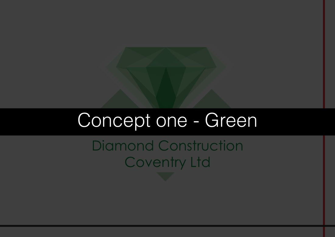
The concepts are then presented as a numbered set rather than as a favourite with alternatives behind it. A client shown one preferred route and two makeweights knows exactly which is which, and either agrees or loses confidence in all three.
- A written brief, taken and documented before any drawing, the folder holds it as its own dated document
- Two rounds of logo concepts, worked as separate InDesign documents
- A presented concept deck, set out as Diamond Construction (Coventry) Ltd, Logo Design and delivered under his own mark
The work