JP Physio
A Durham physiotherapy clinic launching from nothing. The whole identity, logo, brand and the design that carried it, built for opening day.
Objective
A new physiotherapy clinic opens into a market where every competitor looks like a physiotherapy clinic: the same blues, the same stock photography of a hand on a shoulder, the same reassuring vagueness.
JP Physio needed to arrive looking like an established practice on day one, credible enough that a patient choosing between three local clinics has a reason to pick this one, without pretending to a history it did not yet have.
Creative response
The identity, end to end. Logo, brand and the applied design that took it out into the world at launch.
- The logo. The mark the clinic still trades under
- Brand identity. Colour, type and treatment, the rules that keep a small practice looking consistent when it is producing its own material
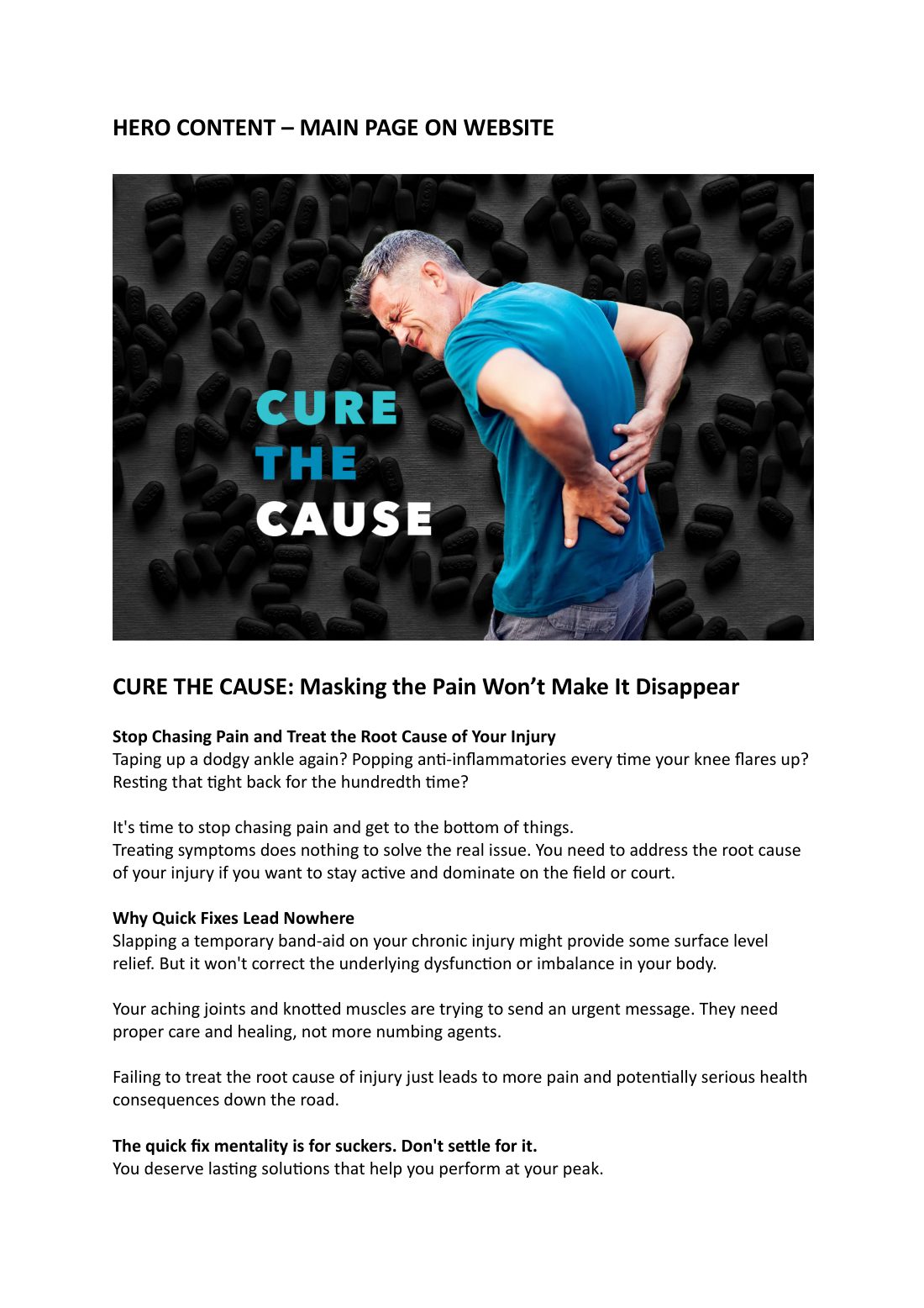
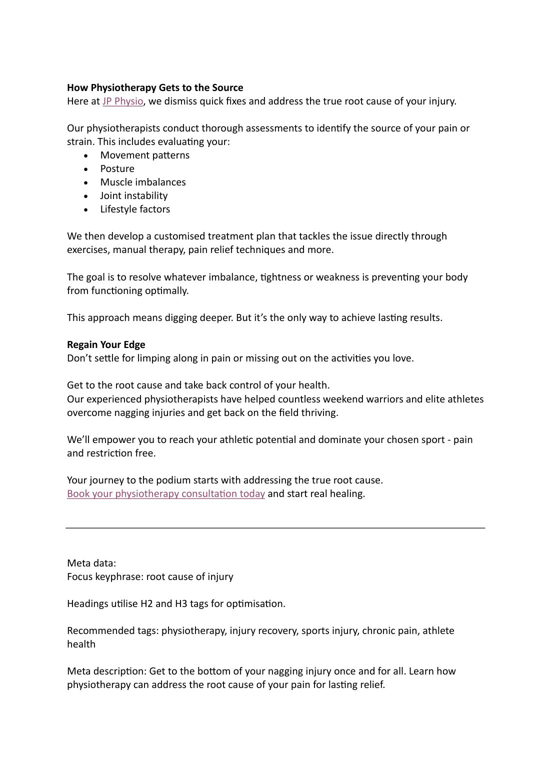
- Launch application. The identity taken across the touchpoints a new clinic needs on opening day
Founder-led clinics are one of the hardest briefs in brand work and one of the least glamorous. The budget is real money out of one person's pocket, there is no marketing department to maintain anything, and the design has to keep working for years without supervision.
Getting that right is a different skill from getting a corporate rebrand right, and it is worth saying so.
- The logo. The mark the clinic still trades under
- Brand identity. Colour, type and treatment, the rules that keep a small practice looking consistent when it is producing its own material
- Launch application. The identity taken across the touchpoints a new clinic needs on opening day
The work