ESG Ratings
The launch of an automated sustainability rating, a scoring system people had to be able to read at a glance, and an explainer built around the word the category is afraid of.
Objective
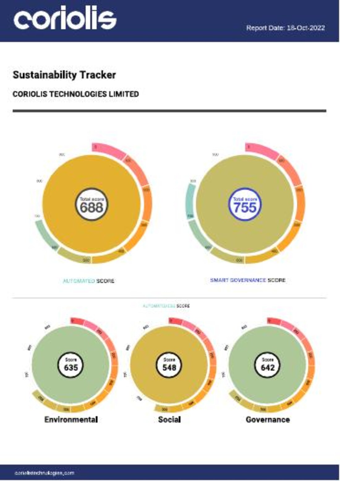
An ESG score is a number a reader has no intuition for. Nobody knows whether 688 is good. They know whether it is better than last time, better than the sector, or close to the top of the range, and only if the design tells them, because the number alone cannot.
The launch had a second problem, which is that the whole category is under suspicion. A new sustainability rating arriving in 2022 was met with the assumption that it existed to make companies look good.
Creative response
Product launch design, report design and data visualisation at Coriolis Technologies.
- The score as a gauge, not a figure. Each rating sits inside a segmented ring running green through yellow and orange to red, with the number in the middle, so the score and its position in the range are read in the same glance
- A hierarchy of rings. Two large gauges for the headline scores, three smaller ones beneath for Environmental, Social and Governance, which states the arithmetic without a sentence of explanation
- The Sustainability Tracker report, dated 18 October 2022, and a companion indicative regulatory report
- Two scoring models shown side by side, an automated score and a smart governance score, rather than one blended figure
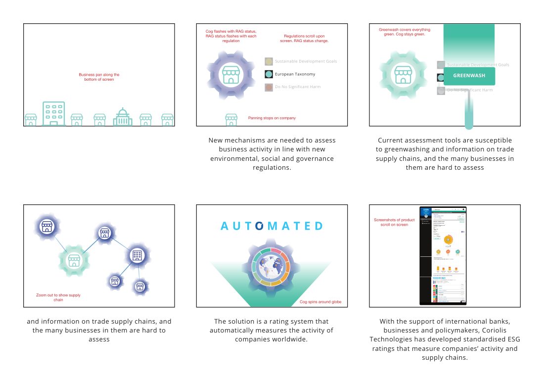
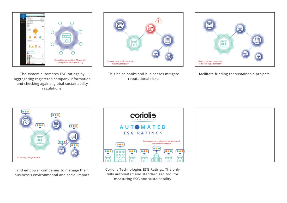
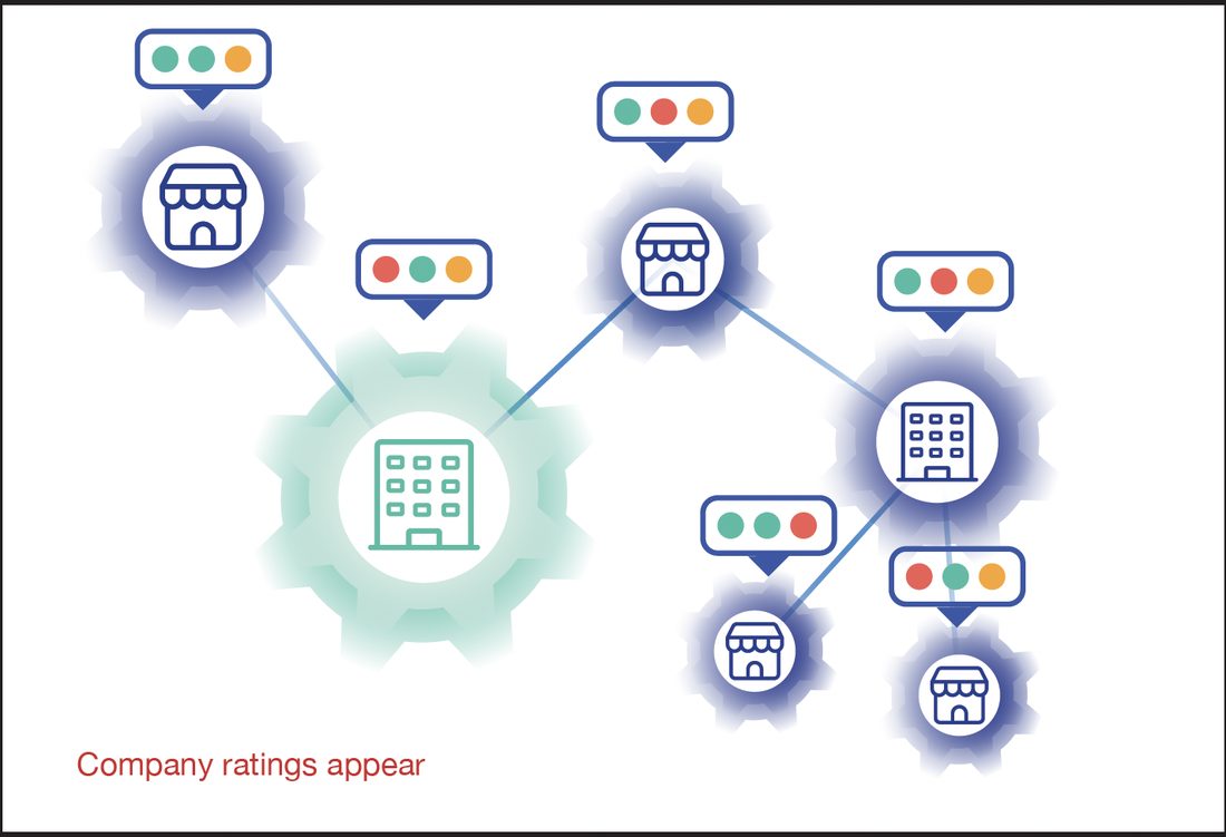
- An illustration system for the launch film, built as components: a paint roller loaded with the word GREENWASH, alarm states in green and red, a segmented rating dial, a globe with location pins, an error mark
- An original voiceover, recorded and cut for the explainer
Naming greenwashing in the launch artwork, a paint roller, the word spelled out on the sleeve, is the same move the Copper brand made a year earlier and for the same reason. The objection a reader already holds is not weakened by being ignored. A rating product that opens by saying the quiet part is a rating product claiming it can tell the difference, which is the only interesting claim available.
Showing two scores rather than one follows from that. A single blended number is easier to put on a slide and impossible to argue with; an automated score beside a governance score invites the reader to notice when the two disagree, which is precisely where the useful information is.
The ring does the quiet work. It carries the range, the bands and the value in one shape, and it is the reason a reader who has never seen the scale can still tell that 548 for Social is the weak one.
- The score as a gauge, not a figure. Each rating sits inside a segmented ring running green through yellow and orange to red, with the number in the middle, so the score and its position in the range are read in the same glance
- A hierarchy of rings. Two large gauges for the headline scores, three smaller ones beneath for Environmental, Social and Governance, which states the arithmetic without a sentence of explanation
- The Sustainability Tracker report, dated 18 October 2022, and a companion indicative regulatory report
- Two scoring models shown side by side, an automated score and a smart governance score, rather than one blended figure
- An illustration system for the launch film, built as components: a paint roller loaded with the word GREENWASH, alarm states in green and red, a segmented rating dial, a globe with location pins, an error mark
- An original voiceover, recorded and cut for the explainer
Watch
The work