UK Exporter Monitor
A monthly and quarterly read on UK export health, co-published with the Institute of Export & International Trade, designed so the month's finding is legible before anyone reaches the numbers.
Objective
A recurring data publication has a problem a one-off report does not: it has to be recognisably the same thing every month while saying something different every month.
Lose the consistency and it stops being a series anybody follows. Lose the difference and readers learn there is no point opening it. And it carries two logos, so the design has to read as a joint product rather than one organisation's report with a partner's mark added at the end.
Creative response
Publication design and data visualisation at Coriolis Technologies, for a series co-branded with the Institute of Export & International Trade.
- A monthly edition and a quarterly edition, sharing a system but not a format: March, April, May, June and July 2022 monthlies, and a Q1 2022 quarterly
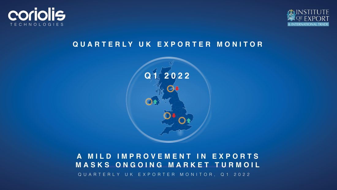
- A cover that states the finding. Not the month's name but the month's conclusion: Downside risks to UK exporter employment in March; A mild improvement in exports masks ongoing market turmoil for Q1
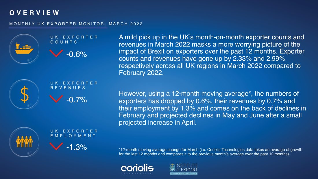
- A three-metric overview panel. Exporter counts, revenues and employment, each with its own icon, its percentage and a coloured arrow, carrying the twelve-month moving average rather than the month-on-month change, with the definition footnoted beneath
- A UK map as the recurring device, held inside a ring on every cover, changing state with the edition
- LinkedIn cut-downs, produced alongside the June and July editions rather than extracted from them afterwards
Putting the conclusion on the cover is the decision the series rests on. Monthly UK Exporter Monitor, March 2022 tells a reader what they are holding; Downside risks to UK exporter employment tells them why to open it. Most recurring reports use the cover for the former and lose the argument there.
The three-metric panel is where the editorial judgement shows. In March 2022 exporter counts and revenues rose month on month, by 2.33% and 2.99%. The three big dials do not show those numbers. They show the twelve-month moving average, down 0.6%, down 0.7%, down 1.3%, three red arrows, and the copy beside them explains that the monthly uptick masks the twelve-month picture.
Putting the flattering number in the prose and the honest one in the dials is a decision most report designs get backwards. The eye takes the arrows and leaves, so the arrows have to carry the reading a skimmer should be left with. The footnote defining the moving average sits directly under them, because a metric a reader cannot check is one they have to take on trust.
Co-publishing
Both logos sit at the same weight, on the same line, in every edition. A co-published series that lets one partner's mark grow stops being co-published the moment a reader notices.
- A monthly edition and a quarterly edition, sharing a system but not a format: March, April, May, June and July 2022 monthlies, and a Q1 2022 quarterly
- A cover that states the finding. Not the month's name but the month's conclusion: Downside risks to UK exporter employment in March; A mild improvement in exports masks ongoing market turmoil for Q1
- A three-metric overview panel. Exporter counts, revenues and employment, each with its own icon, its percentage and a coloured arrow, carrying the twelve-month moving average rather than the month-on-month change, with the definition footnoted beneath
- A UK map as the recurring device, held inside a ring on every cover, changing state with the edition
- LinkedIn cut-downs, produced alongside the June and July editions rather than extracted from them afterwards
Co-publishing
The work